So I want to understand what you are going for here. If I load up minimal theme with your snippets there then this in edit mode:
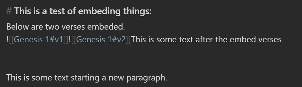
Yields this in preview mode:
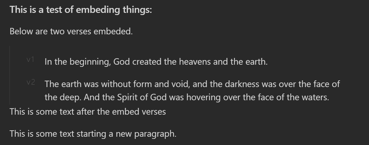
Is the problem just margins being too large? and you want less empty space between the lines? Something like this:
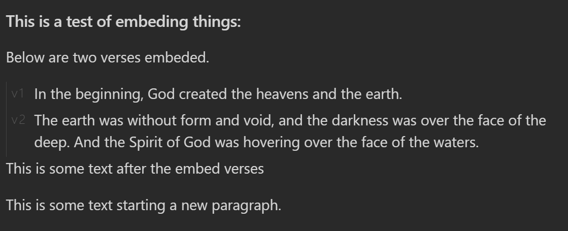
Mostly the issue you are running into is your positioning of the verse headers. You have them as position: relative which allows the you to move it relative to where it would normally be in the flow. That normal spot where it was still exists and takes up space which causes the containers to be taller.
If you use position: absolute, however, the element is removed from the normal flow and no longer affects the positioning or sizes of the other elements.
Here is the snippet I used for the example above. (You can adjust the distance from the top/left to suit your own visual style):
.markdown-preview-view h6 {
  position: absolute;
  left: 5px;
  top: 1px;
  margin: 0px;
}
The other thing to keep in mind is that the first paragraph (<p>) element will have extra margin on the top so setting that to zero will also move things tighter. You can do this with:
.markdown-preview-view .markdown-embed-content p:first-child {
    margin: 0px;
}
You also have your links going across the whole first line. You can change the width and position if you want or you can hide them if you want with a visibility attribute.
div.markdown-embed-link {
    visibility: hidden;
}
Let me know if you have any questions.