This feature is a far cry from the original mode in terms of user experience. Using two fingers to hold down Ctrl+Alt is not an elegant action at all. (In the original mode, you only need to click once, but now you need to hold down these two keys and then click.) In addition, it will open a bunch of unnecessary tabs, which not only occupies memory but also adds a bunch of unnecessary closing actions.
3 Likes
So CTRL+ALT+ Left-click, in order to replace … left-click
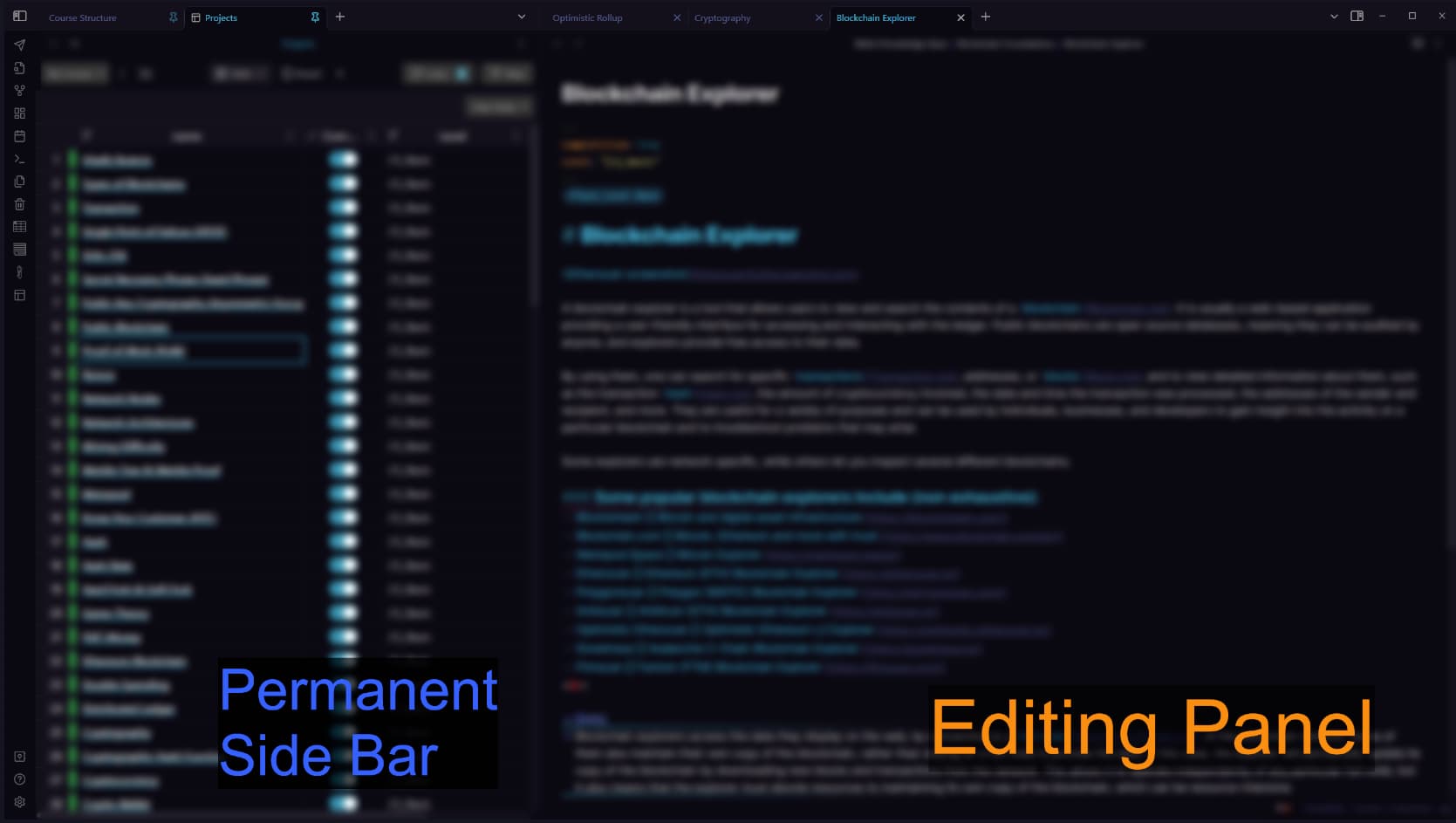
More complicated, and - it actually doesn’t work for the popular plugin called “Projects”, which I use in my sidebar.
I am therefore no longer able to use my sidebar because there is no way to open the links in the Editing right panel).
it’s literally a discussion of
- Old Version =
Left-click&mouse-wheel click
VS - Version 1.3 =
CTRL+ALT+Left-click&Drag-n-Drop, which doesn’t even work with known community plugins
(ok the plugin issue may get fixed at some point by the creator but it still remains seemingly unnecessarily complicated imho).
Just give us the option to chose between the old style or new style at least…
1 Like
I explained the rationale of the change to pinned tabs in the main area in one of the posts above.
I am going to repete nothing changed to pinned tabs in sidebar. Open the sandbox vault put and pinned note in the sidebar and see how it behaves.
Ctrl-alt-click is another change that is not related to sidebars.
This basically is a regression from the nice Obsidian behavior of having two panes, left pinned, option click to open right pane on links, then click in pinned left pane to open the link in the same right pane.
Now we are dealing with tons and tons of opened panes on the right side, leading in memory use in Electron and time using command-w to close all those unnecessary panes.
It’s not even the normal behavior, if you use VSCode and have the browser and two panes, any selections from the browser is sent to the focused pane, not opening a new pane.
Sad that a nice workflow of two-only panes has now been crippled.
1 Like
Yes, give us an option to get back the previous behavior, just adding a new behavior without the option to keep an old one is not good UI design.
1 Like
We have decided to revert to the old behavior in an upcoming release.
12 Likes
Thanks!!!
2 Likes
In v1.3.4, Clicking on links in a pinned tab will now open the link in a visible tab that is not pinned. If there isn’t one, it’ll just open a new tab in the current tab group.
3 Likes
Why not add an option in the settings?
I’m sad to see this reverted. I preferred the new way.
If it was an option in the settings (can be defaulted off) then that would solve all problems.
Now that this is reverted, if you wanted the new way, you can easily replicate the behavior by using Ctrl/Cmd + Click.
2 Likes
That’s still something I have to remember. Having Obsidian work like my browser is preferred, for me. Less things to have to remember. I barely remember any of my hotkeys.
I just don’t understand (even after a quick read of this post and its replies) why an option can’t be added to the settings like the OP stated.
2 Likes
That’s still something I have to remember
The new method was forcing people like me, who work heavily with Obsidian all day, to switch from a simple click, to some clumsy horrible “drag and drop” or CTRL+ALT+click (which is a half broken solution anyway).
And it was adding nothing new in terms of behavior because you can still open a note in a new tab with the mouse-wheel button (or CTRL+left click)…
Are you suggesting that doing a simple mouse-wheel click is harder than doing a slow and clumsy Drag-and-Drop, or CTRL+ALT+Click ?
Also Obsidian is NOT a web browser and should not try to design a user experience for that use case. It’s more relevant to local knowledge base management, and people using it as such had their entire workflow broken. Hence the existence of this topic.
They did the right thing by reverting this mess. It even broke some plugin usages.
1 Like
Which is why having an option to toggle (can be defaulted off) would make everyone happy. Those like me (as I’m sure I’m not alone) could have the browser-like experience and those like you (which it sounds like you aren’t alone) would have your original Obsidian experience.
1 Like
I don’t understand all the fuzz with links & pinned tabs. It would be easier FOR EVERYONE if tabs & links behaviour in obsidian would act like a browser + a simple option to deicide if links should open on current page or new tab by default.
Really, all this adds only confusion to everyone. Why not use like browsers? The simpler the better.
4 Likes