Make the new pinned tab behaviour for opening links optional

Obsidian v1.3.1 will change “open to the right” (ctrl/cmd+alt+click). Now, it will open a new tab in tab group to right. If a tag group to the right already exists, it will add the new tab to it instead of creating a new tab group.

While this is not doing what this feature request is asking, it will address the use case of users who keep an index note to the left and stack of other tabs to the right.

I’ll begin by saying that I do not feel entitled to any particular behavior of Obsidian. I respect the decisions made by the dev team and the hard work they put into the product. Please treat my feedback as contributing, not complaining!


Obsidian v1.3.1 will change “open to the right” (ctrl/cmd+alt+click). Now, it will open a new tab in tab group to right. If a tag group to the right already exists, it will add the the new tab to it instead of creating a new tab group. … it will address the use case of users who keep an index note to the left and stack of other tabs to the right

this will bring back the use case, but the experience will remain sub-optimal, because the opened articles will gradually accumulate on the right. Including (correct me) the clones of the same article, in case it was opened many times. The tabs will consume resources and will need to be cleaned up periodically.

This is a chore, and exactly the chore that was avoided with the Files tab. When you click a note in Files, a new tab is not created – instead an existing tab is “reused” to load the note. This is perfectly consistent with the original behavior of the pinned tab. So I disagree with folks who described the old behavior as confusing. It felt very natural to me.


To summarize, please observe that, before 1.3.0, three distinct actions were supported by links in pinned tabs:

  • Open (click)
  • Open in a new tab (ctrl+click)
  • Open to the right

In 1.3.0 only two actions remain, because “Open” and “Open in a new tab” (in pinned tabs) now do exactly the same thing (correct me). So, logically speaking, the 1.3.0 change amounts to the reduction of user choice. The “open in a new tab” behavior was always accessible to users, and I see no benefit in making it mandatory to everybody.

8 Likes

I am gonna repost here what I wrote on Discord yesterday.

Pinned tab originally was indented as a way of just saying “don’t open other notes here”. Then, in a second moment, it was added a separate concept “but instead reuse/overwrite” a tab in the adjacent tab group.
Many users did not like 1) either the apparent randomness of which tab was going to be recycled or 2) that another tab was going to be touched at all.
Some of these behaviors are a refuse that made sense when we had a pure tiling (panes) interface, now we have a mix of panes (tab groups) and tabs.

With the recent change, we are back to the simple “pinned=don’t open other notes here, don’t touch this”, without the second part “but instead reuse/overwrite” a tab in the adjacent tab group"

Beyond the user facing simplicity, it helps us code-wise to have one consistent way where notes are opened and not have to account for multiple options when adding new features. Adding a toggle cannot be the answer to every, because it increases the cognitive load for new users who have to learn/understand what the toggle does and for the long term maintainability of the code. Plugins are there for customizability.

Reusing a note that is already open in a different tab is an orthogonal topic and you can follow this FR for that:

2 Likes

That solution could solve the problem, good idea! It can be inactive by default, not to overload or confuse the new users, but a possibility to switch on for those, who need this feature.
In the way how it works in 1.3.0, the freedom of choice is decreased and a specific use is imposed on all the users, regardless of their preference. This option was available before (with ctrl+click), so the change didn’t increase the functionality, it only decreased.
Btw: I didn’t experience any random behavior, the link from the pinned tabs were always opening in the same unpinned tab, I could count on that.
But of course: Obsidian is the most brilliant software, full respect for the dev team! This is the first time that my jaws are not dropped when seeing some new feature, development, functionality…

4 Likes

Chiming in to mention that I also really miss the old behavior. The current solution slows me down significantly when reviewing links to a specific not because I either loose the context of the base note when opening a new tab on top of it, or I have to “right-click → search for “open to the right” in the popup” and then end up with countless open tabs on the right side…

I completely get the need for streamlining user interactions and making things cleaner but I think this is really an important use case for power users, because it is the most frictionless behavior when looking into lots of notes with a high frequency. Tbh the current solution feels familiar from browsers, but also unusually “causal user targeted” for Obsidians design ethos.

*disclaimer: I think this is the very first time ever I do not really like a design decision of the Obsidian team, please keep up the amazing work :slight_smile:

2 Likes

Just read this linked thread and learned about the option to pull notes into the sidebar :sweat_smile:
I think this actually fixes my complaint and is a neat solution :relieved:

So great job as always!

I have been having trouble lately with a lot of duplicate tabs appearing, but I see that the behavior of the pinned tabs has changed :thinking:.

In my case, I often hit Open Daily Note button when a pinned tab is in focus, and end up opening several daily notes for the day, and since I have also pinned the task aggregation page with the tasks plugin, when I jump to each task page from there, I also end up mass producing tabs.

I hope the past behavior will be optionally selectable. At the very least, I hope it will no longer open duplicates if the linked file has already been opened.

Is there any way to revert the v1.3 changes to opening method in pinned/linked panes? My vault is all kinds of screwed up after this change. It was lovely and working with this set up before:
Clicking on things in files/search/ or any of the pinned tabs would open them in the Main Pane which would update the linked graph/outline. Now it opens them in a new tab by default which is absolutely maddening.

2 Likes

(Sorry about the misslick for the posts above, I didn't realize CTRL+ENTER meant posting until I refresh the page).

If I remember correctly, before v1.3, if you had a pinned tab located inside a left side panel, and you used the:

  • 1/ Left click on your mouse - Option 1
    → it would open the link on the panel on which you are working.

  • 2/ Middle click (the clickable mouse-wheel button) - Option 2
    → it would open the link in a new tab, in the same panel (which is exactly the current default behavior in v1.3)

Therefore, I fail to see where the improvement is. The update v1.3 just removed Option 1, and made Option 2 the default, without adding anything new at all.

2 Likes

The behavior of pinned tabs in the sidebars has not changed. Both 1 and 2 still work the same. Try in the sandbox vault. (That’s why above I encouraged users to put pinned tabs in the sidebars)

I have been following this topic for a long time and I finally couldn’t resist registering an account to express my opposition.

We can understand that many people do not like the mode of clicking links in the original pinned tab, support the addition of new modes, and also support setting the new mode as default, but we completely oppose canceling the old mode.

The reason that retaining the old mode will cause trouble for users is not valid. The coolest thing about OB is that it can be set up the way we want it to be, rather than choosing a style that some people think is better. Just like Apple thinks that 3.5-inch phones are the best and 6-inch phones are foolish.

OB itself is very complex, so if you think that too many options will confuse users, most of OB’s functions should be removed. There should be no themes, no dataview, no quickadd plugins, they are too complex. Even the option of strict line breaks should not exist. It should be made like Evernote, without giving users any choices.

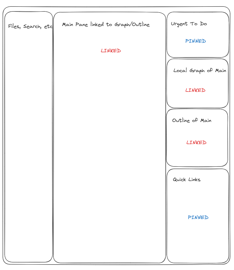
Finally, for locked pages, many of our users lock MOC, which is equivalent to a browser bookmark. Opening it on a certain page is equivalent to clicking a bookmark in the browser to open a link in the current page instead of opening it in a new tab. It can also be seen as a more flexible file list. Clicking a file in the file list opens the note in a fixed tab. In many cases, opening a bunch of tabs is foolish, and making users add many actions to close tabs is also foolish.

Dragging MOC to the sidebar is also foolish. Previously, fixing MOC only required a shortcut key, and the new mode requires adding a drag and a close action. The old mode could expand and fix multiple MOCs, but now only two can be fixed.

Finally, if a bug becomes a feature, it should be retained instead of being discarded just because the author does not need it. This behavior is not at all OB-like, it is very Apple-like, authoritarian, dictatorial, and indifferent to user feedback.

3 Likes

You are right, we can definitely achieve this through the sidebar. But this requires adding a drag-and-drop action, which will also affect the functionality of the sidebar (in many cases, the sidebar should not be obscured and we can only fix a limited number of pages in the sidebar).

1 Like

Again, as I mentioned above, we also made change to open to the right (ctrl/cmd-alt-click) for people who keep a fixed note/index to the left and open notes to the right.

This feature is a far cry from the original mode in terms of user experience. Using two fingers to hold down Ctrl+Alt is not an elegant action at all. (In the original mode, you only need to click once, but now you need to hold down these two keys and then click.) In addition, it will open a bunch of unnecessary tabs, which not only occupies memory but also adds a bunch of unnecessary closing actions.

3 Likes

So CTRL+ALT+ Left-click, in order to replace … left-click
More complicated, and - it actually doesn’t work for the popular plugin called “Projects”, which I use in my sidebar.

I am therefore no longer able to use my sidebar because there is no way to open the links in the Editing right panel).


it’s literally a discussion of

  • Old Version = Left-click & mouse-wheel click
    VS
  • Version 1.3 = CTRL+ALT+Left-click & Drag-n-Drop, which doesn’t even work with known community plugins
    (ok the plugin issue may get fixed at some point by the creator but it still remains seemingly unnecessarily complicated imho).

Just give us the option to chose between the old style or new style at least…

1 Like

I explained the rationale of the change to pinned tabs in the main area in one of the posts above.

I am going to repete nothing changed to pinned tabs in sidebar. Open the sandbox vault put and pinned note in the sidebar and see how it behaves.

Ctrl-alt-click is another change that is not related to sidebars.

This basically is a regression from the nice Obsidian behavior of having two panes, left pinned, option click to open right pane on links, then click in pinned left pane to open the link in the same right pane.

Now we are dealing with tons and tons of opened panes on the right side, leading in memory use in Electron and time using command-w to close all those unnecessary panes.

It’s not even the normal behavior, if you use VSCode and have the browser and two panes, any selections from the browser is sent to the focused pane, not opening a new pane.

Sad that a nice workflow of two-only panes has now been crippled.

1 Like

Yes, give us an option to get back the previous behavior, just adding a new behavior without the option to keep an old one is not good UI design.

1 Like

We have decided to revert to the old behavior in an upcoming release.

12 Likes

Thanks!!!

2 Likes