Use case or problem
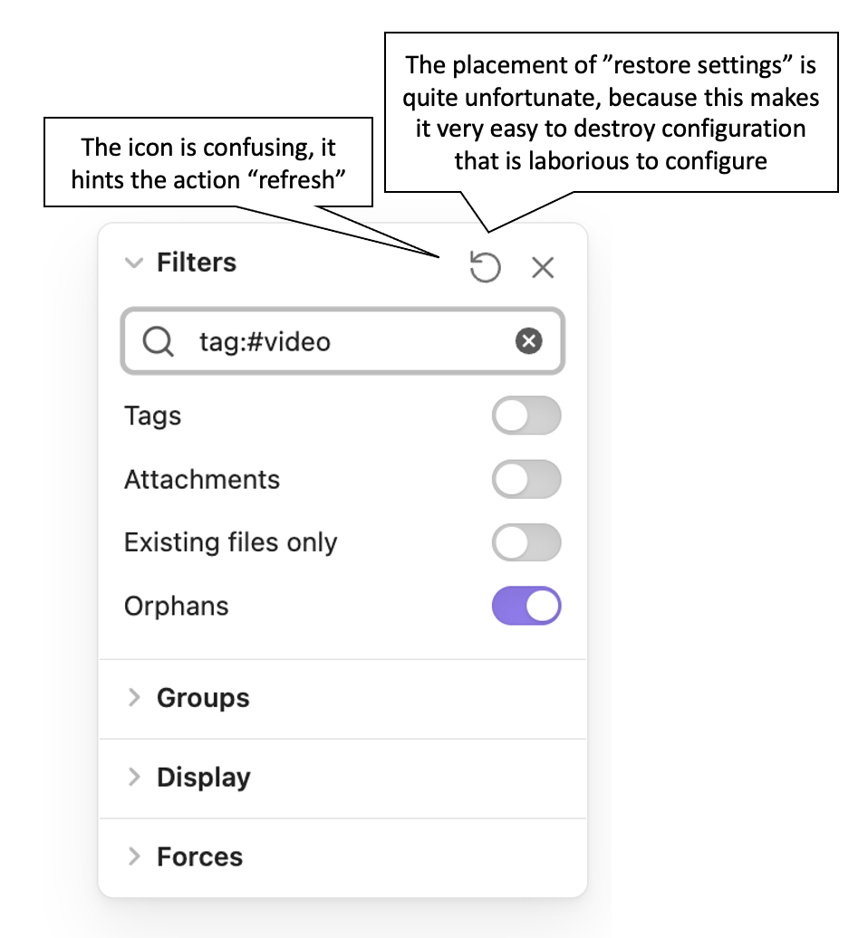
When using the graph-view and playing with the filter, it is TOO EASY to restore the settings BY MISTAKE, thus loosing all the filter settings which take a considerable effort to make. The source of the problem is that the icon for “restoring the configuration” has two issues:
- Misleading → It resembles the “refresh” functionality
- Misplaced → Such drastic functionality does not need to be right beside the area where users fiddle with the inputs to the filter
Proposed solution
- At least, change the icon to something different, for example, a crossed cogwheel, or some other thing that does not resemble “retry” or “refresh”
- Please consider either moving that functionality to another place, such as the bottom part of the filter, or at least add a confirmation popup so that users realize what is about to happen
Thank you very much for this amazing tool and forum!