CSS snippet (no good, since it does not allow to toggle)
hide note (also removes the bridge ‘keywords’)
What I’m trying to do
Adding notes
In my vault I mix three major content types: references to articles, concepts and individuals. The references import metadata/keywords that are imported as separate notes.
Eg the article ‘The evolution of contemporary visuals arts from a lion’s perspective’ would have the keywords/topics of ‘visual arts’, ‘lion’ and thusly two (empty) notes will be created aka [[visual arts]] and [[lion]].
When a second article is imported with a title such as “The evolution of contemporary visual arts from the perspective of a turtle” it might automatically import [[visual arts]] and [[turtle]].
Both articles/notes are now connected through the empty note of [[visual arts]].
Browsing notes
In the graph view I would like to hide the title of the articles, but still be able to see the title of the empty notes. The reason is simple: when adding a ton of articles, the graph view gets cluttered with article titles, whereas the goals is to see the relation of the keywords (through the article note as somewhat of a bridge between terms/keywords).
Question
Is it possible to toggle/hide the title of specific notes (but show all other note titles) based on either a
tag
path
frontmatter (aka type: article)
Toggle since I sometimes nonetheless want to see the title of the article note. I, in ‘exploring’ mode, would like to hide to keep a non-cluttered view of the graph. Only hide the title since I need the link to the keyword.
So I thought I should have a stab at this, so I tried locating the CSS related to the graph view. It turns out that all the content is part of a <canvas> element, as shown below:
However, if my little research is correct, this also means that it’s not readily available for styling through CSS. So I don’t think this can be done by normal means.
Possible alternate solution?
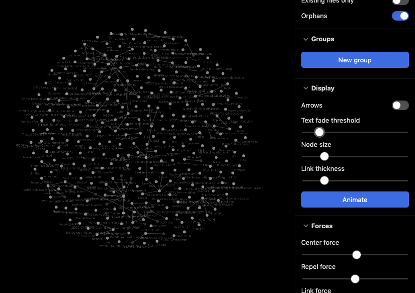
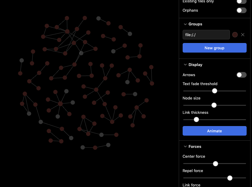
As I read your request your aim is to locate non-existing notes, but it’s hard to do so due to note title being in the way. In addition all the existing notes make the graph view cluttered. I might have an idea, which potentially could do as a workaround. First let’s view my test vaults graph view with default settings (under the Minimal theme in dark mode):
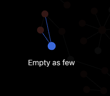
And the beauty of it all, is that now you can hover over the grey nodes, and actually see the title of the non-existing titles. I hovered over the one at around 8 o’clock (down to the left), and it showed this:
Thanks for the reply, but not exactly what I need. Allow me to explain it differently.
I need to discover the relationship between different topics. So when
an article talks about ‘topic 1’ and ‘topic 2’,
another article on ‘topic 1’ and topic 2’ and ‘topic 3’,
and yet another one about ‘topic 1’, topic 2’ and ‘topic 3’,
and finally a fourth article on ‘topic 1’, ‘topic 2’ and ‘topic 4’
I then can assume that ‘topic 1’ and ‘topic 2’ must have some common traits (cause all four articles mentioned ‘topic 1’ and ‘topic 2’. So I should examine their relationship, or at least consider these quite relevant topics for the articles I collected.
In order to see the relationship between these topics, I need to use the graph showing all articles AND all topics and see how they are related. That works, however, the articles have a title shown on the graph. And at that stage the articles are not relevant to me. I, in the exploring modus of topics, only need to see which topics are related, I do not need to see the actual titles of the articles. Even stronger, they clutter the whole graph view which leads to mee not seeing these topics any longer.
So I would like to be able to toggle off the display of these article/note titles in my ‘exploring modus’. A visibility: hidden would work wonders, but the graph works with WebGL, so little can be expected there.
As you most likely have understood we don’t currently have many options related to showing/hiding the titles themselves, except from the text threshold.
However, we do have groups, and the main thought behind my previous post was to hide the text and emphasize nodes through color, and thereby use visual clues to help locate interesting sections.
So, could it be an option to hide all titles, as before, but add text into those topics/notes you want to highlight (or hide away), and then use groups based on line() searches for color coding those nodes?
By the way, have you looked at Juggl - Juggl ? It’s a graph view plugin which is stylable using CSS and directly from the plugin interface. I’ve not used it myself, yet, but maybe that could be tailored to your needs?
Juggl would come very close indeed (I initially used it to define link types), however it does not work for ‘large’ vaults. Large here is defined as a vault with over 200 notes. A local graph might work, so it comes ‘closer’ to what I wanted to do. Too bad it does not allow for larger vaults.
If no other solutions comes up, I might give it a go nonetheless.
The line() search is something I quite don’t understand, but possibly for I don’t want to hover over all notes. I merely would prefer to see the nodes at once. I ‘simply’ need to be able to view all at onces, topics that is.
But again, maybe I don’t understand your approach.
I’m going to stop soon, as I’m not that into graph view, and possibly your use case, but my idea with the line: () search would be to use to help localise point of interests in the graph view.
Lets say you wanted to work with stuff related to a topic which was marked with topic: photography, you could then make a new group, do a search for line: (topic photography) and mark them in a distinct color.
Now any nodes with that topic should stand out, and could help you localise clusters related to the topic. And hopefully, based on that or similar groups you could see where you should focus your effort related to seeing connection between nodes you haven’t seen.
Simply put, I’m thinking along the lines of make what you look for stand out more using colors, rather than focusing on hiding text of particular nodes.
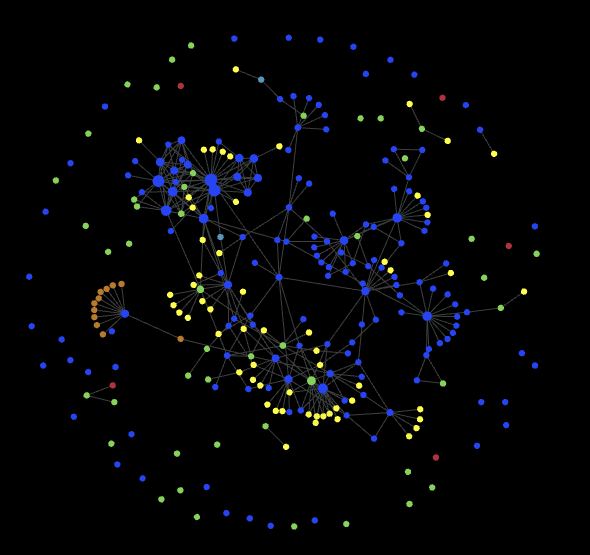
Too many of (green) journal entries are not connected to anything else
In general I’ve got too many stand alone (blue) notes which also are connected
The clusters I’ve got, does make sense (when I hover over them), but I would like for them to be even more separated
So that’s some of the points I need to work with in my vault. And with more colors, I could deduce more stuff. This view doesn’t show tags, as I’m in the process of reworking those, and they just make my graph become a massive cluster of nothingness.
For those who are interested, I found a workaround. I installed a plugin called Front matter title that uses the alias as the title on the graph, and I added an alias for all references with a single letter (in my case):
---
alias: .
---
This shows the alias in the graph, which means a single dot.
You can use both whitelist and blacklists, so I limit the alias in the graph to my whitelist of refs folder. Result it that all other aliases in other folders are still being used for other purposes. Each ref receives an alias (aka the dot) automatically.