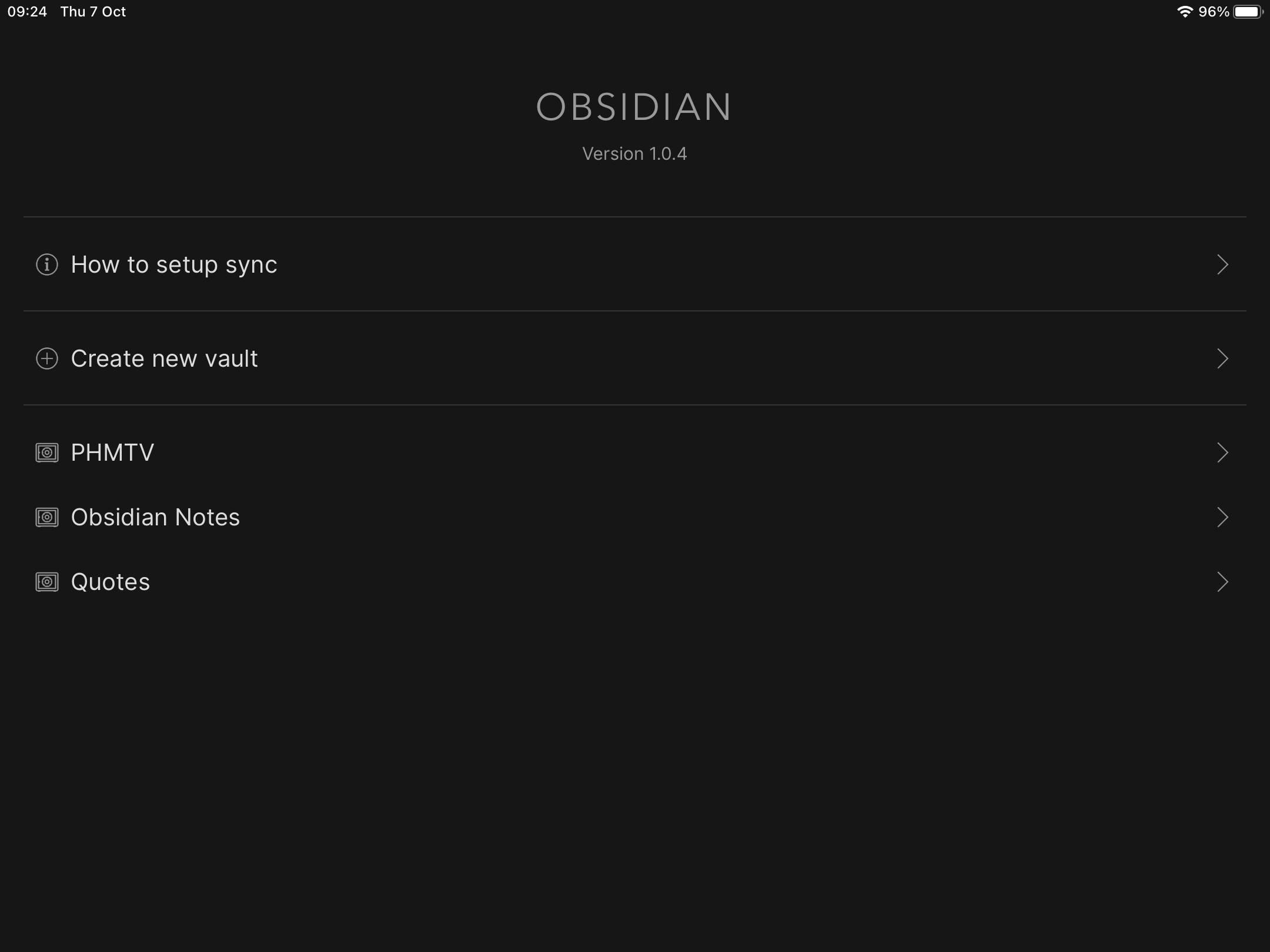
Right now it requires 3 clicks to switch between the vaults in the iOS app (click on the vaults icon, select the vault, click “Enter vault”). It would be amazing to have a way to switch between vaults in one-click. It might not sound like much, but a more seamless experience of working on multiple vaults would make a big difference.
Maybe above the vaults icon (in the bottom-left corner of the screen) there could be icons that allow you to switch to different vaults in one tap. Basically like Discord allows you to switch between servers.
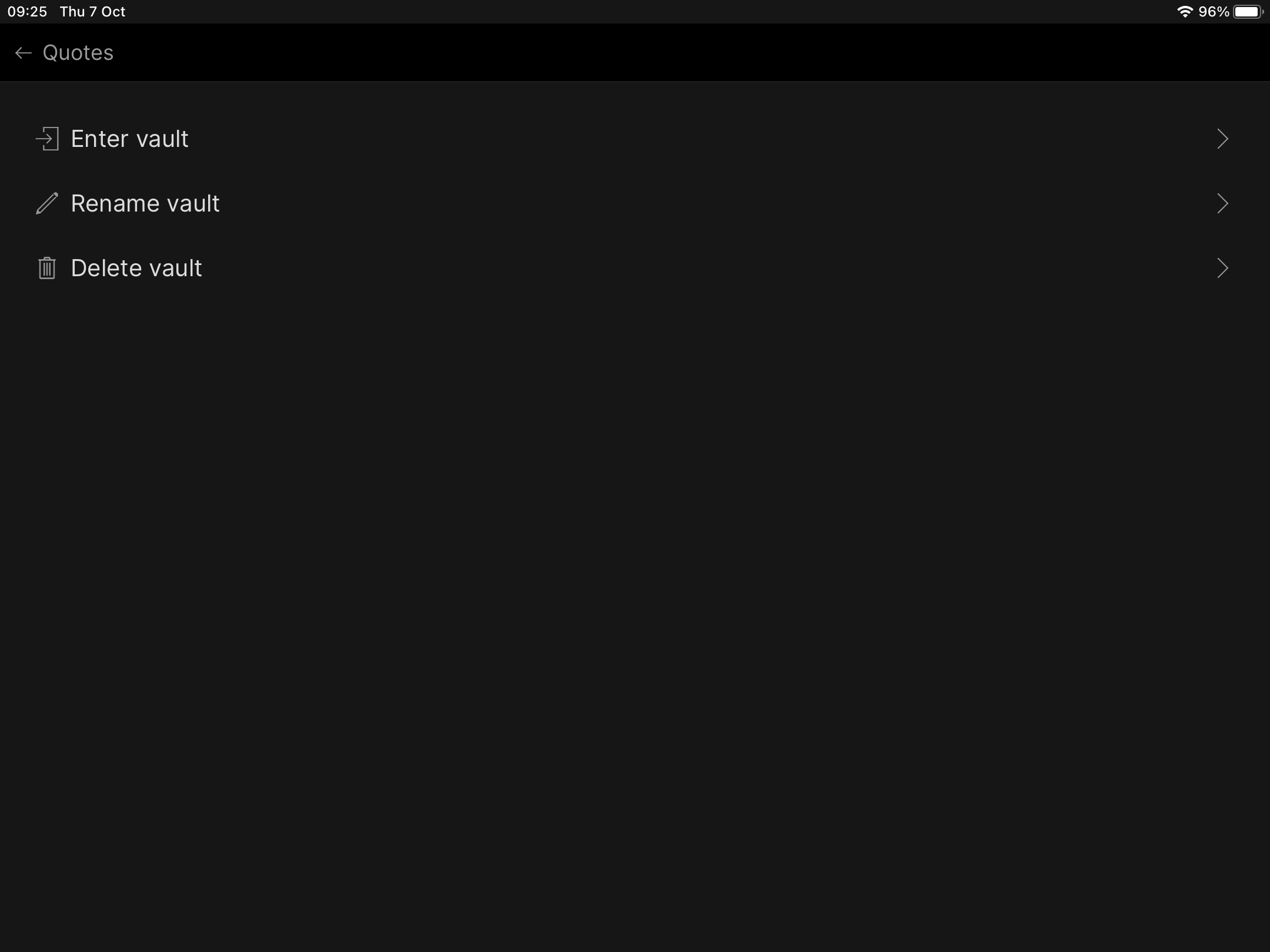
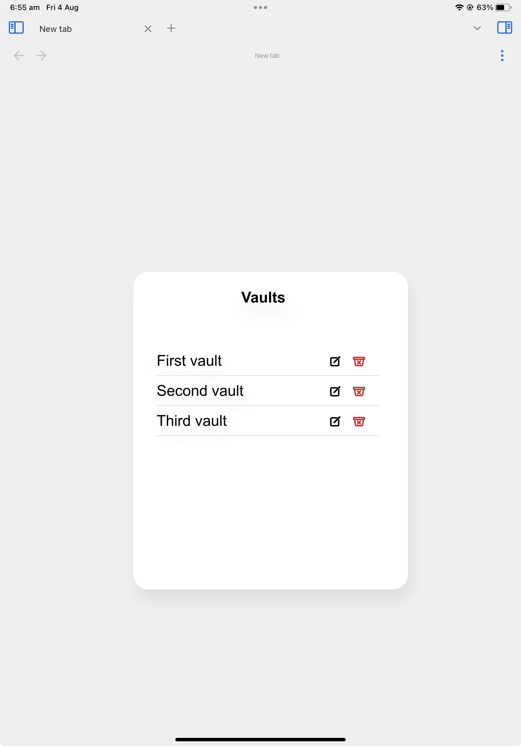
Currently at step (3) I am presented with three options:
A. Enter vault
B. Rename vault
C. Delete vault
It is extremely rare that I want to do operations (B) and (C).
I suggest you update the vault list to add a “Settings” button for each vault on the right hand side. If people tap the vault name, the vault can open immediately. In the rare cases where people want to do (B) or (C), they can tap the smaller “Settings” button.
Relatedly: I am a little bit scared by how easy it is to accidentally tap the “Delete vault” button at the moment. I’m seeing that button hundreds of times per month, and I have accidentally tapped it a few times. I’ve been saved by the “are you sure?” dialog, but unfortunately the button spacing on the “are you sure?” dialogs is not large enough, so I can easily imagine accidentally tapping “yes” rather than “no” one day, and actually deleting the vault.
I’d like to second the notion that it takes too many clicks to switch vaults on mobile. This would be a simple improvement.
However, it’s possible to remove one more tap from the process by copying how Slack treats servers:
Vaults are assigned in order to keyboard shortcuts like cmd-1, cmd-2. (modifiers may be necessary)
When swiping from the left, the vaults are enumerated vertically with icons. Tapping on them switches directly.
To delete vaults or rename them, you could long press on the item. Depending on the exact layout, you could imagine using a kebab menu or something similar instead.
One other alternative would be to show a native iOS contextual menu when holding the Vault button down, with the vaults listed. This could be a good balance between being quick to implement and fast to use.
Yes, the Vaults menu prioritizes the actions that are used the least, and that Delete button worries me, too.
For the same reason, I think the “How to” and “new vault” buttons should go below the existing vaults. They’ll still be the first thing that new users see, but they’ll be out of the way for everyone else.
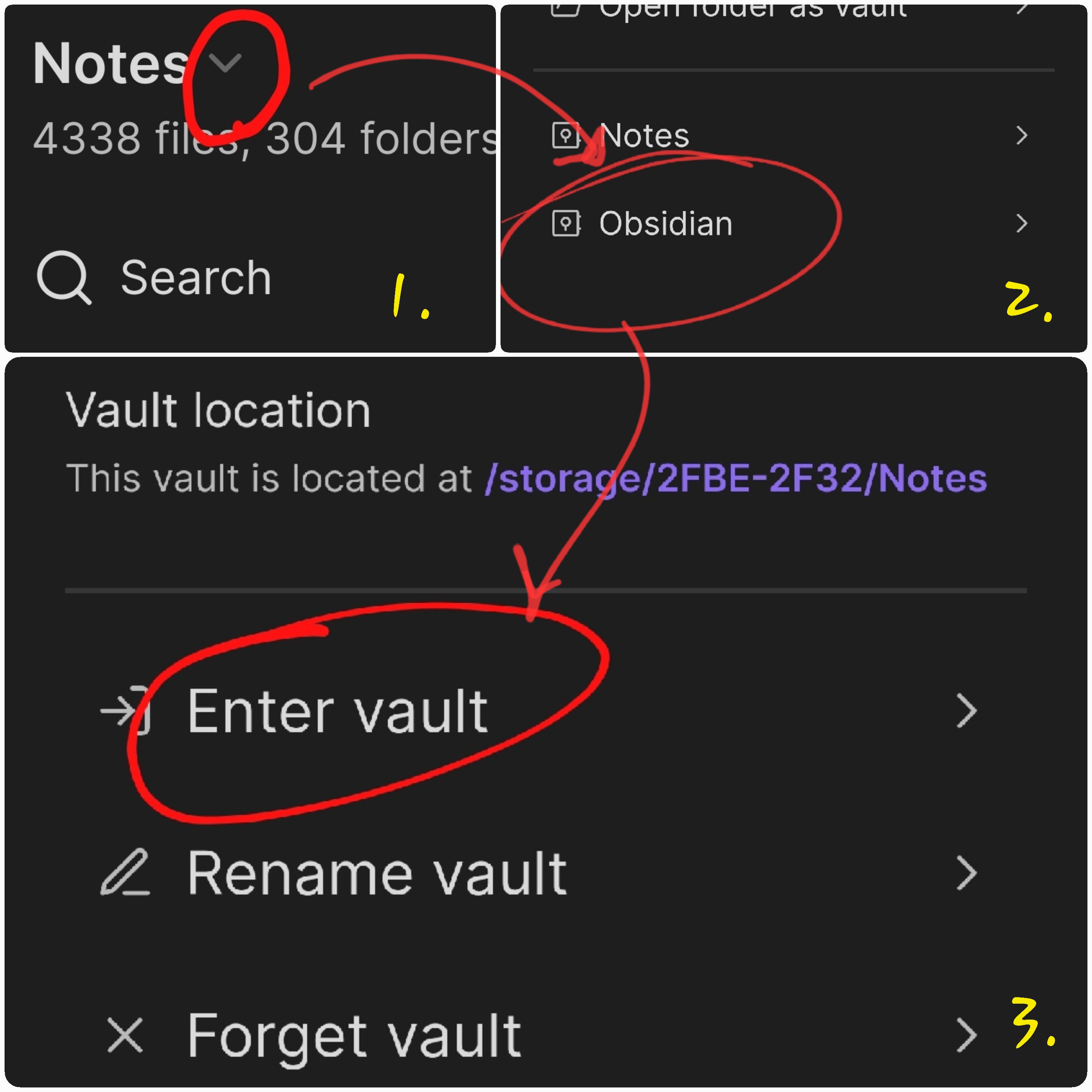
Excellent idea. On that list would be an “edit” button, which would allow you to rename or delete vaults. A simple tap would take you back to your just-previously-used vault.
Opening vaults on iOS requires two taps: the second tap being the “Enter Vault” option. That extra tap is unnecessary.
Typical iOS behavior for elements like this would suggest putting the much less frequent rename/delete options in a context menu or secondary UI. For inspiration I would look to the Files app, where tapping on a folder opens it and a long-press brings up a context menu with options like Delete, Rename, etc. Since vaults are conceptually similar to folders this type of UI would seem to make sense.
Agreed here. One possibility to increase discovery would be to add some symbol to the end of each vault name in the list, an info (i) button, three dots, or some other indicator that could be tapped to surface those less-frequently used options.
I also find this a little annoying as someone who switches between vaults a lot. It takes 3 taps to open a vault, and the taps are on different parts of the screen so there’s finger-stretching.
I am thankful for this menu but we (I?) really need a better vault switching Ux. With the slow load times (yes, remove plugins etc) this extra dialog is so annoying and dare I say adds friction to my and likely most people’s workflow. My theory is most people switch often and rarely create so why force this dialog every time when we rarely need it?
Can it be made to work like the attached? Thanks for considering!
Currently, switching between vaults is a tedious process on Windows and Android.
You have to navigate to the vault menu, then tap on the vault (on android, it’s one more step of tapping on the vault name, then tapping “Open Vault”).
Suggestion:
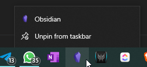
I suggest adding app shortcuts containing the vault names (via right click on taskbar icon in Windows or by long pressing the app icon on Android).
This way, we can open whichever vault we need immediately, without having to open the recently opened vault, navigate to the menu and then open the same.
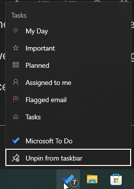
This is the long-tap menu on android that usually has shortcuts for the app. We need useful shortcuts as well. For example, here’s the app shortcut menu for Microsoft To-Do:
I’d love a rework of the UI to include a vault switcher a la OneNote. It’s one of the features I think OneNote gets right. The equivalent to a vault is a Notebook in OneNote.
It should be relatively simple to switch/update the theme in the same manner we do, and to restore the previous workspace by default.
Oh my goodness, you read my mind. This would be fantastic. One of my main vaults that I often open on my phone is huge, so it’s loading time is long (on Android), and if I want to instead open one of the vaults for my fiction writing, it makes the process really arduous. I’d love-love to see a simple one-press on Android, and contextual menu on Windows to sort this out.
100% agree! When I’m on Android it’s rarely worth the hassle of switching from one large vault to another. I get stuck on whatever vault I was on most recently, and am forced to fall back to other note apps when I just need to make a quick one.
Sepparate Icons for each of my vaults would be a real chef’s kiss. I’ve figured out how to do that on MacOS, and that makes my life so much easier! Now for Windows and Android…
One of the things that doesn’t encourage me to use multiple vaults is the switching process between them. I have to launch the vaults selection window, select the vault I need, then carefully select from the three options the one allowing me to open that vault - and to be extra careful not to select the delete option - which is not very intuitive.
Please make it better.
I’m attaching a 10 seconds mock of what it could be like. Clicking on the vault name should open it straight away. For other options, could be from a drop down menu next to vault name or some visible buttons next to it.
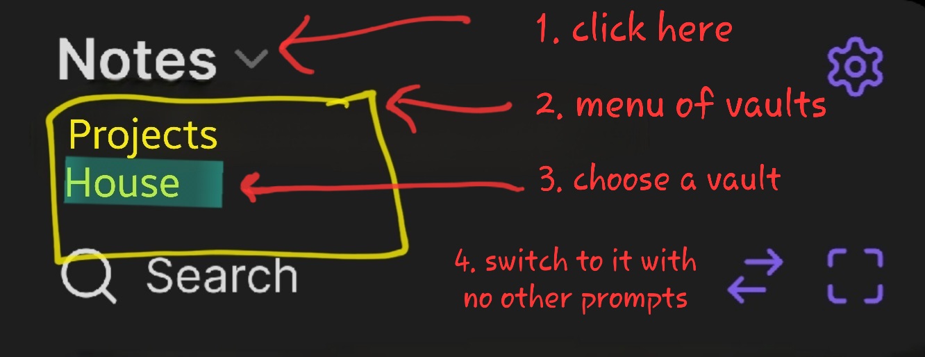
In the left sidebar, tap the vault name or the downward-pointing arrowhead next to it. A list will appear that lets you switch between vaults directly.
Thanks for the reply. I should have made it clear that this is for iPad/phones. On Mac/Windows I agree it’s easier (with many workarounds available to make it even easier)
What I described is for mobile — I mean the vault name at the top of the left sidebar, not in the vault switcher. (The vault switcher still works the way you describe.)