I’m trying to use Obsidian with some glare on my screen during daytime. This makes it quite hard to make out the icons on the left side (search, files, back, forward, collapse and all the icons along the left strip).
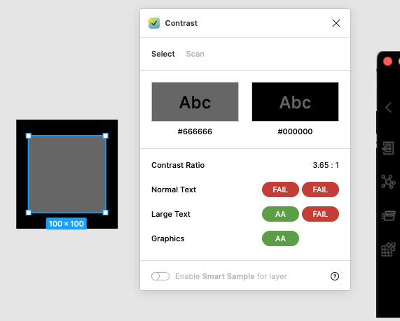
I tried checking the contrast of these icons and got some poor results according to the WCAG:
The current ratio is 3.65:1, while the WCAG “requires” a minimum of 4.5:1. I used a color picker on a screenshot, so my value of #666666 might be inaccurate.
Proposed solution
Make the color of the icons lighter when they are not selected. #757575 would meet the minimum requirements, #959595 would meet the enhanced requirements. Of course it’s not as easy as changing this one color, as all the visual hierarchy will change with this. But having your minimum contrast level be perceivable is a good baseline, and then you can have higher and higher contrast from there.
Yes. I don’t know why almost everyone today goes for these “gray in lightgray” themes. It’s so hard for my poor eyes. Especially, as you mention, with glare screens.
No, I added other things to basically increase readability (e.g. tinted bold in dark mode), and a bunch of more “functional” stuff like hiding a lot of clutter, adding relationship lines etc.