Can you turn this function into a plug-in ?
What are you hoping the plugin would do? This snippet can be added to your snippets folder without the need for a plugin.
@kepano: the 2 main differences between a snippet and a plug-in, as far as I can tell, is that with a plug-in one can toggle a plug-in off and on, plus one can check for updates from within Obsidian.
BTW, I want to congratulate you with a professional looking theme, augmented by the Minimal-theme-settings and Hider plug-ins.
1 Like
Thanks! At the moment I don’t have plans to turn this into a plugin. But anyone is welcome to take my code and do so.
I think a plugin could take this concept further and give users more flexibility in the formatting to solve some of the limitations of the pure CSS approach surfaced in this thread.
Converting to plug-ins is highly recommended. And supports url images
That bit is an artefact of the snippet; it is not intended by me. That said, in the edit mode/pure md text I am using something I blagged from someone (sorry my source- keeping is not good). This enables a “On This Day” list to be developed, thusly…
<span style="column-width: 250px; font-size: 11.5px;">![[2010-12-22]]</span>
Each year gets an entry, and the specific date is generated each day by my text-expander. The left part you refer to is a blank year in the past - for which there is no corresponding daily note.

Am I doing something wrong! I named the CSS file img-grid and did the same as you showed in the video but the images are aligning naturally.
Ok. Thank you very much. That looks good
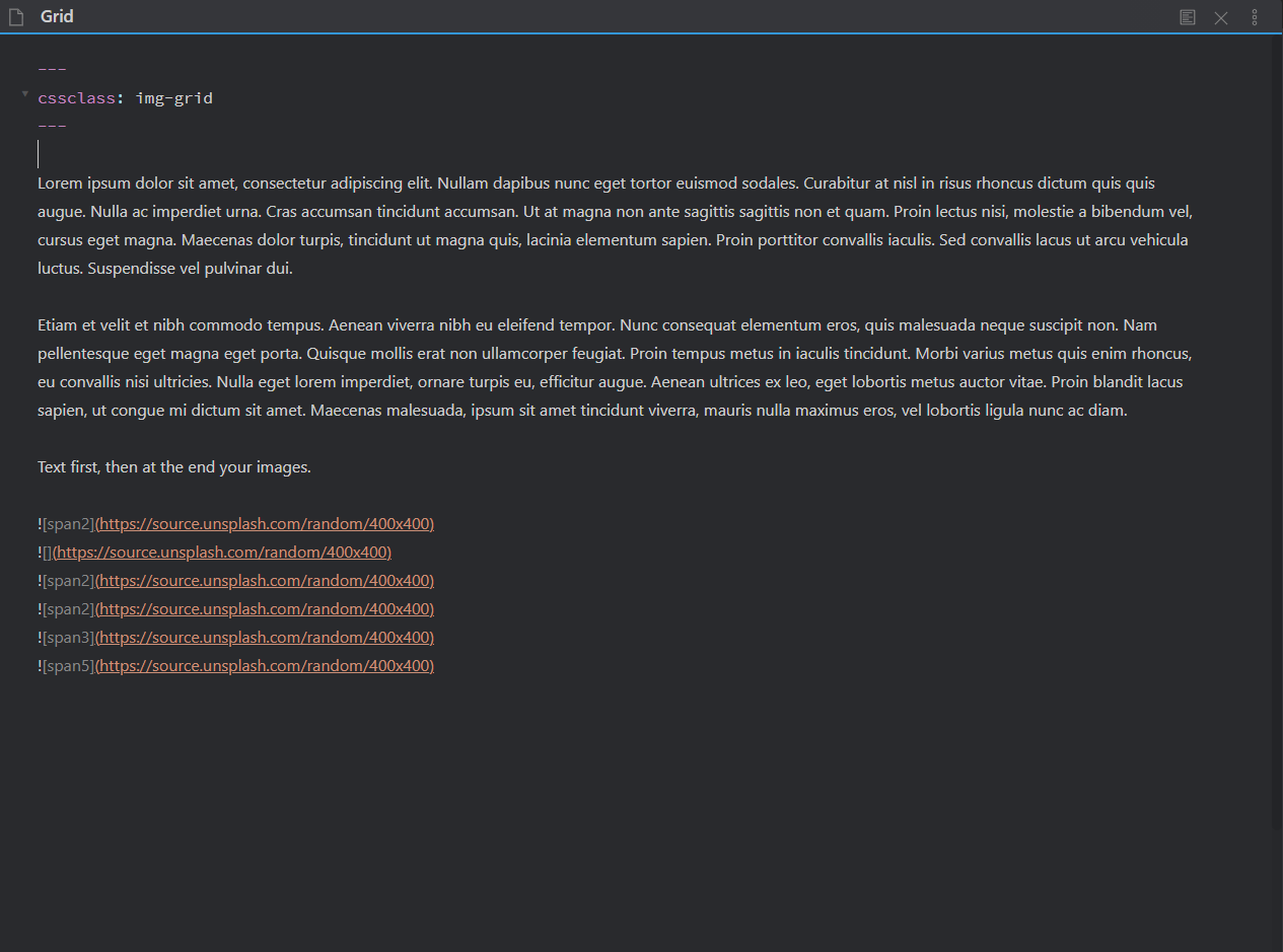
---
cssclass: img-grid
---
Maybe it’s written like this
1 Like
That is correct. @Daniyal-Ahmed you should be using dashes not tildes and there needs to be a space after the colon. See the official documentation.
1 Like
Ok, thanks, it works now, it’s great to have this snippet!
I have been playing with the idea and came up with another css grid solution based on this idea, which works well for my needs:
.img-grid .markdown-preview-section > div > p {
	display: grid;
	grid-template-columns: repeat(5, minmax(0, 100%));
	column-gap: 1rem;
	row-gap: 1rem;
	align-items: stretch;
}
.img-grid .markdown-preview-section > div > p > img + br{display: none;}
.img-grid .markdown-preview-section img:not(:active) {
	object-fit:cover;
	width: 100%;
	height: auto;
}
You can just change the number 5 in the line…
grid-template-columns: repeat(5, minmax(0, 100%));
…to adjust the amount of columns you want to use.
You could even create different css snippets for different amount of columns, for example img-grid3 for 3 columns and img-grid5 for 5 columns.
1 Like
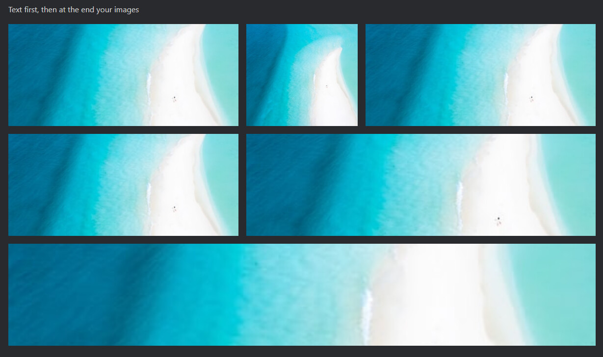
Furthermore, you can add span rules and invoke these by using the tag in the markdown img link als demonstrated below:
.img-grid .markdown-preview-section img:not(:active)[alt="span2"]{
	grid-column: span 2;
}
.img-grid .markdown-preview-section img:not(:active)[alt="span3"]{
	grid-column: span 3;
}
So when adding these markdown lines:


…the result is:

@frvkl: this does not work for me. The images are just shown vertically.
Just to make sure: with your code one also needs to add to the note:
---
cssclass: img-grid
---
right? That’s what I did anyway and it does not work.
@klaas I am on v0.10.01 on Windows 10 using the standard Obsidian (Light) Theme.
The code does work for me, with all other custom CSS snippets turned off.
The note needs to start with the YAML snippet below (before any other lines!).
---
cssclass: img-grid
---I can confirm the grid code is working on v0.10.6. I have made a small change to prevent other divs turning into columns. When using the code below, you just have to make sure that the images are listed last on the page, as the ammended snippet only targets the last content div on the page:
.img-grid .markdown-preview-section > div:last-of-type > p {
    display: grid;
    grid-template-columns: repeat(5, minmax(0, 100%));
    gap: 1rem;
    align-items: stretch;
}
.img-grid .markdown-preview-section > div > p > img + br{display: none;}
.img-grid .markdown-preview-section img:not(:active) {
    object-fit:cover;
    width: 100%;
    height: auto;
    max-height: 20vh;
}
.img-grid .markdown-preview-section img:not(:active)[alt="span2"]{
    grid-column: span 2;
}
.img-grid .markdown-preview-section img:not(:active)[alt="span3"]{
    grid-column: span 3;
}
.img-grid .markdown-preview-section img:not(:active)[alt="span4"]{
    grid-column: span 4;
}
.img-grid .markdown-preview-section img:not(:active)[alt="span5"]{
    grid-column: span 5;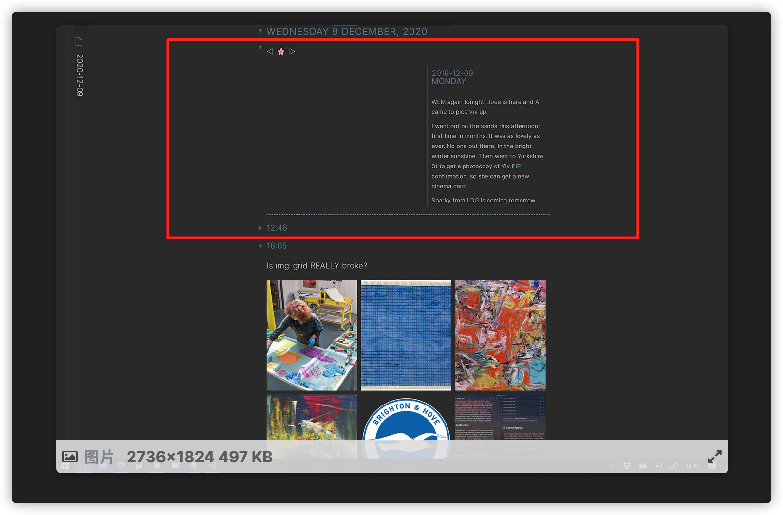
}Do I understand this correctly: if you have a note with text, you have to put the images at the end of the text?
If that is correct, I assume they will be shown at the bottom of the note in Preview, correct?