Dataview: Page Link in YAML suddenly not working, Also WHERE Page Link?

Things I have tried

Research and various code options.

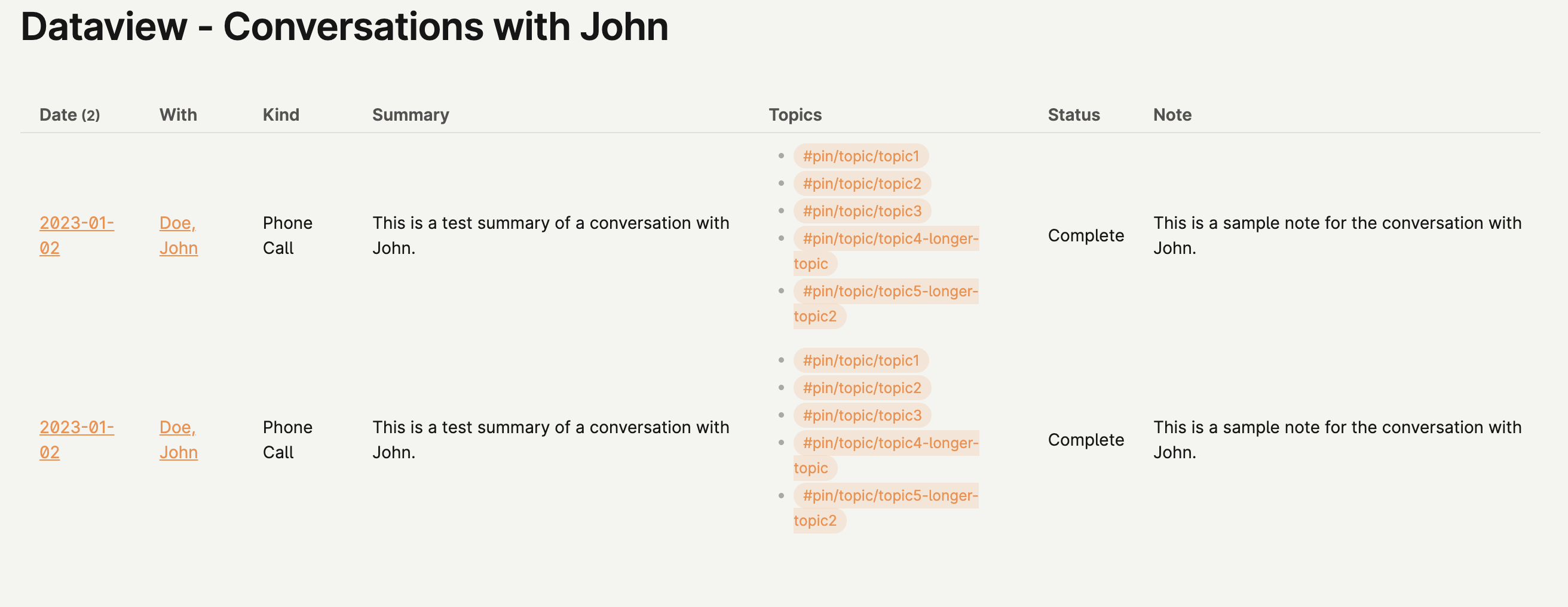
What I’m trying to do

I felt I was able to do this before, but suddenly it’s not working. Basically, In my YAML for a page logging a conversation with a person, I have a link to a person’s page.

e.g. With: [[Doe, John]].

This works, but I want my dataview results to treat the name like a page link so that I can open that person’s page directly. I really feel this was automatic, but now it’s not working.

Additionally, in my dataview code, I want to see conversations only with that person.

Here is my code:

TABLE WITHOUT ID link(file.link, dateformat(Date, "yyyy-MM-dd")) AS "Date", Kind, With, Summary, Tags as "Topics", Status, Note
FROM #note/type/conversation AND -"Templates"
WHERE contains(With, [[Doe, John]])
SORT Date DESC

I’ve tried many other options:
WHERE contains(With, “[[Doe, John]]”) and other variations with the “=” sign, but the only thing that works is if I write “John” or “Doe”, but that doesn’t help cause there might be more than one John.

(on a somewhat separate issue, the tags I’m using for topics are often many and they mess up the formatting of my table. Is there a way for the tags to not be centered, but start at the top of the row? I also have columns that are very long and others that are very short so wanting to format my table more readably.

Try With: "[[Doe, John]]" in your YAML. Brackets in YAML indicate lists, so you need to put quotes around them to make a text string.

YAML syntax reference: YAML - Wikipedia

1 Like

great, that worked! Any ideas about my addition question about formatting the table?

Kind of hard to give suggestion on how to improve a table, when we don’t see how the table is currently formatted. So please provide some examples on your table, and what you like/don’t like with it.

good point… here’s a test table… you see how the summary is very long, but the rest is short and the text wraps. can I shorten the summary column so the rest doesn’t wrap? Also, you see how the tags are centered such that they go above and below the rest… Can they be top aligned so the rows dont look so cluttered. This is worse when some rows only have 1 tag.

I can’t give very specific advice, but try searching table format or table column width here, or asking the CSS wizards in the #appearance channel on Obsidian’s Discord.

I think i figured out that it’s based on CSS, and that the minimal theme and it’s associated style plugins give some extra help in this area. So I switched themes and it’s much better, but that’s not the best solution if I like the other theme. But since I dont know anything about CSS, it’s good enough for now. there are a lot of customizaton options w/ that theme to make it how I want it for the most part. cheers

Not sure how to handle the column width in a good way, besides possibly doing a custom class for that particular table, and setting the width of the nth-child to a specific percentage, or similar.

The way this would work then would be to specify that custom class in the frontmatter where you want this using cssClass: yourClassName, and use this in the CSS snippet when formatting the table.

Regarding the second part, doing vertical-align: top on the td’s should do the trick. Not sure how much else that would affect.

Anyways, here is a sample CSS to get you started:

.wideFirstColumn .dataview.table-view-table tr th:nth-child(1),
.wideFirstColumn .dataview.table-view-table tr td:nth-child(1) {
  width: 90%;
}

.dataview.table-view-table td {
  vertical-align: top;
}

Store this in vault/.obsidian/snippets/tableSomething.css, and enable that snippet in Settings > Appearance (CSS snippets) > tableSomething. If you then specify cssClass: wideFirstColumn it should give more room for the first column. Change the (1) to whatever column you would like to play around with, and change the width: 90%, to something which gives the wanted effect.

A useful tip when playing around with various CSS selectors: Add a statement like background-color: green into the body of the selector you’re playing around with, to see that you target the correct box.

Disclaimer: This barely scratches the surface of what can be done, but it should have an immediate effect on your table, and is hopefully enough to get you going to format according to your will.

1 Like

This topic was automatically closed 90 days after the last reply. New replies are no longer allowed.