Platform
iOS
Android
Obsidian Mobile version: v1.4.1
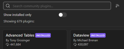
Use case or problem
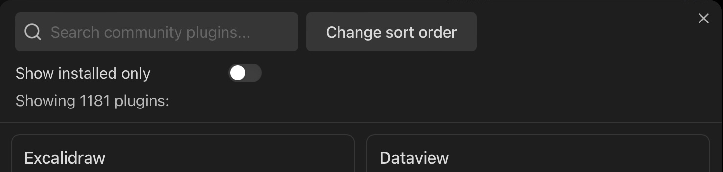
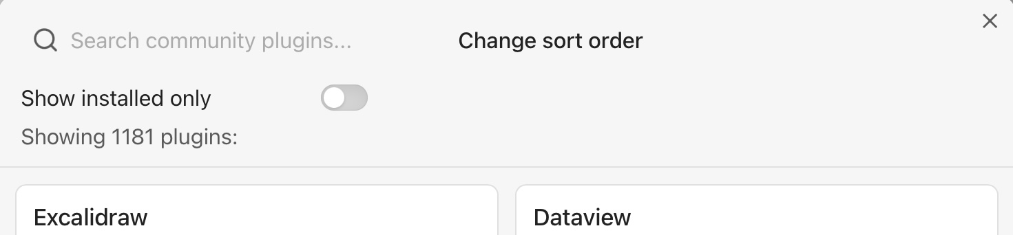
In light mode on iPad (but not iPhone) the formatting of the Browse Community Plugins search field and “Change sort order” control makes them less obvious than they should be. (Screenshots: [Bug] Missing formatting in Community Plugins search in Light Mode on tablet - #6 by CawlinTeffid)
The control looks like plain text, not like an interactive element, and its almost-centered position makes it look like it’s the title of the window.
Proposed solution
Make the search field a box like Obsidian’s other search fields.
Format “Change sort order” in a box with drop-down arrow to match Obsidian’s other dropdowns.
Edits
- Noticed the problem only exists in light mode. Removed positioning suggestions because they’re not needed when the elements are formatted correctly.
- Changed title from “[Feature] Improve formatting of Community Plugins search in Light Mode” to “[Bug] Missing formatting in Community Plugins search in Light Mode” because it seems clearer now that the light mode style isn’t intended.
- 2023-09-20: Specified that it’s only on iPad, not iPhone.